Friday, 23 December 2011

Milton Glaser


Milton Glaser is one of the illustrators that I have found as part of my development within looking into influential graphic designers and illustrators research. He is a historic designer and best known for creating the famous I Heart NY Logo


He also created this 1975 poster of Bob Dylan for an album cover for his greatest hits .Really like the Dylan piece, when I was searching it stood out to me, at is reminded me of the idea process I am doing at the moment, with black and white images and colourful pieces swimming out of the piece! Really love it!

I also really like this image for a poster for a festival, I like the use of bold flowing colours, very inspirational towards my final pieces.


Thursday, 22 December 2011

Bob Peaks

An illustrator I have looked into is the American illustrator Bob Peaks, he is well known as a film poster illustrator and also a commercial one. His work is mainly in the 1950s and 60s and was dubbed "the father of the modern movie poster" He has also created 20 covers for Times Magazine and 39 Covers for TV Guide in America.
He first became a success by creating the poster for the 1961 West Side Story. I like how he uses simple line drawings and accompanies them with a bold of striking colour for a contrast. I want my image to be simple yet striking.


this is a poster for the 1966 film Camelot.


1961West Side Story poster


The Voyage - key film art.


Wednesday, 21 December 2011

work in progress

Currently coming towards the end of the alight project, over the holidays I have been experimenting with patterns, creating them, colours etc. and painting pattern designs to music, sometimes you can get a bit carried away I found!
I still want to do a fair few things really, I've had personal and family related matters happen over these past few weeks, so I feel I have neglected a few days work. I am hoping issues will be resolved. It's not something I wish to indulge on a blogging site, but I feel that it is on my mind, and relating to my work mind too.

Thursday, 8 December 2011

Feedback.

Yesterday I had a workshop session, and was given feedback on my work so far, it was suggested to me that I needed to find more traditional artists to find inspiration from and sometimes it isn't thought of as a good idea to search for new/contemporary illustrators, as your style could become like theirs, which usually tends to be identical to hundred of other people's styles, which okay, yes, fair enough. It's a good point. But I was struggling at the beginning of this project, and even slightly further into it. So I was given the advice to have a look at some other illustrators, just to give me some inspiration, I did that. And it worked. Made me feel motivated. I, myself don't believe it to be copying anyone's style really, because that is not my aim, I am still finding it, and still learning.
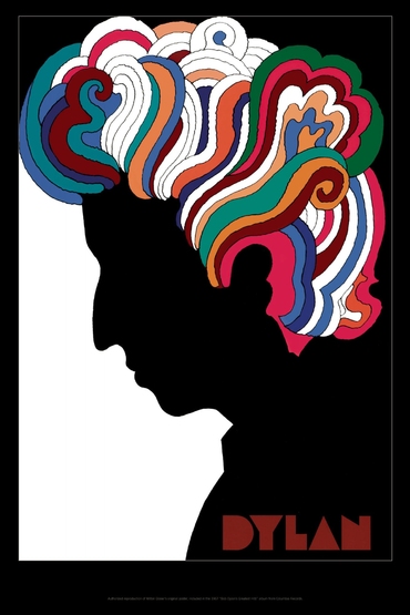
I also showed my Photoshop trials of my hand. I wanted to put my illustration through photoshop just to see what it would look like as a silhoutte, you know, would it be recognisable as a hand? would it blend in too much? would it just turn out like a blob? I just wanted to see, and it was a form of experimentation and development. I feel that a conclusion was jumped to before I got a chance to explain that these were for development, and not necessarily for the final outcome, I have mentioned on the blog how I prefer my hands to stay as a hand drawn illustration, even though they will be scanned in, I still want that illustrative element in there. I wish that I had been given more of a chance to explain. I understand I wasn't being got at, it was just advice at the end of the day. However, I did say that I wanted to use an element of photoshop within my work, I just wanted to try it, I hardly ever use it really, but i thought that the idea of having a basic silhouette with all this colour flowing and exploding from it would be a really good visual image, the contrast of colour against the black, Yes, it might be a bit of a clash, but that is why I am still working on the colour palettes within it. But yes, my colours, I want to put on with pencils, paints, etc. I don't want my whole piece to be Photoshopped, I just want to use a part of it, I don't understand why such a deal had to be made. I am not totally succumbing to the whole magical world that is considered around the software, I am literally learning, I just wanted to see what I could create, I don't think that's wrong, I think that it's part of development overall when it comes to finding my illustrative style. after all I am still learning! I am on a design course!
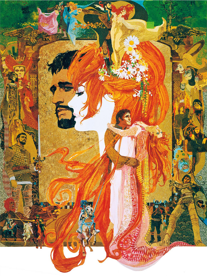
It was also suggested to me to create my colours and my "music" on a bigger scale compared to my building/hand silhouettes, my tutor said that it would be great to see all of those colours "growing" away from them, which I agree with, I would like to see what it would look like having all the "music" coming away from my shadows, spreading widely. So I;m going to be doing a few more experimentations!

Tuesday, 6 December 2011

Experimenting with illustration to Photoshop.

As part of development and experimentation within this project, I wanted to use Photoshop partially within my design. My plan was to use silhouettes with colourful illustrations coming from them, I also needed to include my hands so I scanned in my illustrated hands and began to turn them into a silhouette on Photoshop, as I began the process I thought that the stages on the way were quite interesting so I saved the images all seperately, as I though they gave out lots of different styles/impressions.


I needed to change the outline of the hands to white, so firstly, to make it easier for me to see I changed the background colour to a brighter one, so I chose red, there isn't really any specific reason why.

I then began to colour the hands in black to start the silhouette

I began to erase all of the small details within the hands like crevices, nails, shadows etc, but wanted to see what the hands would look like this their basic shape still outlined.

this is the silhouette of the hands completely coloured in. In my opinion I think it's a strange shape and I dont really think you can tell easily what they are, so I think people who see the image will struggle to depict what the shape actually is. However, I don't really like the image where I still have the basic outline shape showing up in white. I dont think it looks good at all. To be honest, I still like the hands in their original form, just in pen. I just wanted to see what they would look like as a silhouette because my venues were silhouettes and they black would stand out alot against the colourful background shapes...but I really like the white original hands, I'm sure I can find a way to make them fit into the final pieces. I do however, quite like the image where one of the hands is black and one of them is red, maybe I could experiment more with using that...

Experimenting with colour palettes.


I printed out multiple images of my silhouettes and began experimenting with different colours, whilst listening to some music, to start off with, I found it difficult to come up with patterns/designs etc, but as I got more and more in to it I really began to enjoy it.


Really like this one with all of the triangles, I like that they appear like arrows that are helping to visualise the fact that music is coming out of the venue and spreading, growing etc. 


I want to include both the hands and the venue within my final piece(s)


I really like this one too and the colour palette that I used.

The public is being informed!

So far, I've seen nothing to advertise Alight, I know it's early, but I just wanted to see if anything had been written about it, as part of my research, and to see how much was known about it etc. So when I went to the Western Park Museum I had a look at their guides and brochures collection and I found this.


it's a fold out family event planner October 2011 to March next year, and March is when Alight is taking place, so I thought I'd have a look.


And sure enough here it is! It's where the Animal Carnival is taking place, Western Park Museum. It says: "The talented students of Sheffield's Music Academy will compose and perform movements depicting alternative animals, some associated with Sheffield, in a performance of Carnival of Animals by Saint Saens. The composers have worked together before to produce pieces including The Cutlery Concerto and Floods.
Alight, led by Sheffield Philharmonic Chorus is part of Music Nation, a countdown to the London 2012 Festival , the finale of the Cultural Olympiad"

So at least some advertising is happening!

Monday, 5 December 2011

Process


    I took some of my images on my Venues the I'd drawn and I put them into photoshop to create silhouettes towards my final images. I touched the images up a bit too, making them more solid etc. 


City Center

Town Hall

Winter Garden

I'm really happy with the way that they came out in the process. I think that the silhouettes are obvious of what they are too, which is what I wanted, you can tell which venues they are within Sheffield which I think is VERY important, now I am wondering whether to do all of the venues or just a few? I like the idea of having a solid silhouette in my idea, against all of the flowing illustrations that I am going to add. I need to experiment with the colours I want to use too.

More research!

The other day I went for a walk around to take better images of venues. The previous images I took where only with my camera phone, but finally! My cameras working again! So I went around the city and took some images, I ventured to Western Park Museum as well, I'd never been before it was amazing! I even took my time to go around the exhibits too...I couldn't help it.

Winter Garden


Town Hall


the clock tower on Sheffield Town hall, is I think, what most people recognise it from, the tall statue of the God Vulcan on top of it.


I've always liked this little rooftop, I'm not sure why, I just think there is something quite dainty about it.


City Hall


Western Park Museum 


Loved these little patterns in the stone at Western Park, reminded me of art deco.


City Hall 


Also, I've never noticed the detailed carvings on the top of the columns on city hall, they're fantastic!

I wanted to get lots of closeups and different angles on the buildings, look at key features etc.