For this project we were given the idea to create an illustration for the alight festival. We had to choose how we would output the design too, I decided to focus on a tshirt design for a young audience, I wanted the piece to also focus on the aspect of the music and how the festival is aimed at the community of sheffield to celebrate their city. I decided on creating a visual metaphor for the music by creating illustrations and patterns whilst listening to music, I thought it would be interesting to see what patterns I came out with. I really enjoyed doing this I used watercolours, pens, pencil crayons for my markmaking of the music. I listened to lots of different kinds of music
mostly classic and orchestral, as an orchestra was holding the festival. I did a few of these painting to music techniques and I really enjoyed it! for my final pieces i scanned in the painted patterns onto photoshop and edited on their, I included my illustrated hands too, to strengthen the idea of togetherness, because it is a simple yet meaningful symbol - handholding. I wanted the music to be travelling up to the hands. I stated that I would be using photoshop within this project, it isn't an area I am comfortable with, but i am pleased with my final outcome. I am disappointed I was not shortlisted for the project, but that was due to illness and not being able to present my work. I feel that I would have had more motivation to push my idea further. Like maybe even printing one of my designs onto an actual tshirt. I feel there is definite room for improvement, I could have developed it more, but I did want a fairly simply yet effective image. I liked the idea of a black silhouette for my buildings and I liked the idea of illustrated hands, and I believe colour and a grey background link the too in a subtle yet successful way.
http://www.youtube.com/watch?v=36ireOG4Q84
http://www.youtube.com/watch?v=xoHECVnQC7A
Tuesday, 10 January 2012
Final Pieces on a Tshirt
I just wanted to see what my final pieces looked like on what they were designer for which is a tshirt. I quite like how they appear. I did think about different ways to create the tshirts, I thought of the idea of making a design that had all three of them on just one. Which could work, however having all three on one tshirt limits the consumer's choice down to literally one, whereas if I created tshirts that had just one design on each then that would give the consumer more choice so they could pick what they wanted


Final Pieces.
These are my final piece images, that I will be printing out. These images are designed for a t-shirt that has a target audience of young adults and teenagers. I think that with this target audience in mind, these illustrations are quite appealing. I added a subtle grey background colour as a midtone between the black and white to subdue the clashing contrast of the two, and also my illustrated hands would just blend into the background it it was still white, so I think the grey helps to pick out everything on the piece.


I like the colours within this one, but i believe this is the one that I would like to develop more than any of the others, I believe the paint could have been smoothed out more, however, I didn't want to manipulate the painted image that much on photoshop really.

this is my favourite of the final pieces I really love the bright colours and how busy the piece is without being too busy, the music that I was listening to when I drew out this illustration was a piece that was quite heavy on brass instruments. I think that this illustration is quite successful in showing the illusion of a loud energetic piece of music, I also like how they are pointing out into the air like arrows, showing that the music is coming from within the venue.
Wednesday, 4 January 2012
design experimentation.
These are images that I have scanned in of my experimentation with adding a visual metaphor of music for my alight designs, I have used pens as well as paint on these, and experimented with how to make the colours flow. I listened to music whilst doing these, just orchestral music, even classic FM! I enjoyed doing this experimenting.


These ones where created with watercolour and blowing through a straw, I really liked this effect, I loved the flowing of it and how unpredictable the path of it could go.


I really like this idea, I liked the idea of the circles, and the flowing they created, like bubbles, just floating.


these were just done by splashing and flicking my paintbrush onto the paper. I didn't think it really represented music that well.

this one was an A3 piece of paper, so I had to scan it in in two pieces because my scanner here at home is only a4. So I put it together in photoshop, I also messed around with the saturation and hue on the piece, just to see how it would look with the paints being a bolder colour, as some had not been picked up by the scanner. I didn't use this in the end as I wanted all of my pieces to match, and as this was in landscape it wouldnt match my two other pieces that I planned to do in portrait.
Friday, 23 December 2011
Milton Glaser
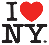
Milton Glaser is one of the illustrators that I have found as part of my development within looking into influential graphic designers and illustrators research. He is a historic designer and best known for creating the famous I Heart NY Logo

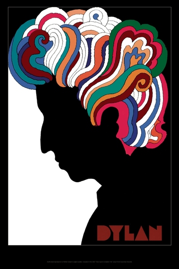
He also created this 1975 poster of Bob Dylan for an album cover for his greatest hits .Really like the Dylan piece, when I was searching it stood out to me, at is reminded me of the idea process I am doing at the moment, with black and white images and colourful pieces swimming out of the piece! Really love it!


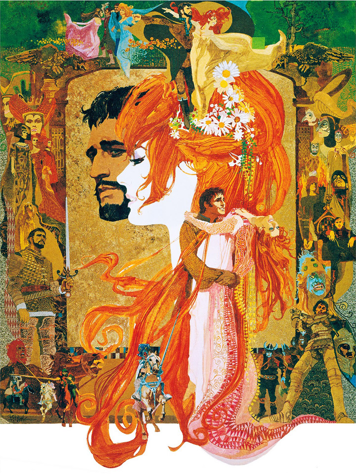
I also really like this image for a poster for a festival, I like the use of bold flowing colours, very inspirational towards my final pieces.
Thursday, 22 December 2011
Bob Peaks
An illustrator I have looked into is the American illustrator Bob Peaks, he is well known as a film poster illustrator and also a commercial one. His work is mainly in the 1950s and 60s and was dubbed "the father of the modern movie poster" He has also created 20 covers for Times Magazine and 39 Covers for TV Guide in America.
He first became a success by creating the poster for the 1961 West Side Story. I like how he uses simple line drawings and accompanies them with a bold of striking colour for a contrast. I want my image to be simple yet striking.


this is a poster for the 1966 film Camelot.

1961West Side Story poster

The Voyage - key film art.
Wednesday, 21 December 2011
work in progress
Currently coming towards the end of the alight project, over the holidays I have been experimenting with patterns, creating them, colours etc. and painting pattern designs to music, sometimes you can get a bit carried away I found!
I still want to do a fair few things really, I've had personal and family related matters happen over these past few weeks, so I feel I have neglected a few days work. I am hoping issues will be resolved. It's not something I wish to indulge on a blogging site, but I feel that it is on my mind, and relating to my work mind too.
I still want to do a fair few things really, I've had personal and family related matters happen over these past few weeks, so I feel I have neglected a few days work. I am hoping issues will be resolved. It's not something I wish to indulge on a blogging site, but I feel that it is on my mind, and relating to my work mind too.
Subscribe to:
Posts (Atom)